Guide Hands-on
How to Build an Animated Landing Page with AI Prompts in Lovable or Cursor (Step by Step)
 Anna · Designer & web developerUpdated 2026-11-06 · How we test
A web designer's workflow for animated landing pages with AI tools like Lovable, Cursor and Claude Code: setup, prompt structure, 5 effect ideas with live demos, performance and handoff.
I'm Anna, a web designer and developer. I build client sites in Framer, WordPress and plain code, and for the code ones I work with AI every day, mostly in Claude Code. I've also used Lovable. This is the process I'd recommend for an animated landing page with an AI coder. The tool matters less than you'd think; most of the difference between a generic page and a good one is in how you prompt.
I'll cover setup, prompt structure, five effects with demos you can inspect, performance, and handoff. Some links are affiliate links.
Before you prompt: the three decisions
1. Lovable or Cursor?
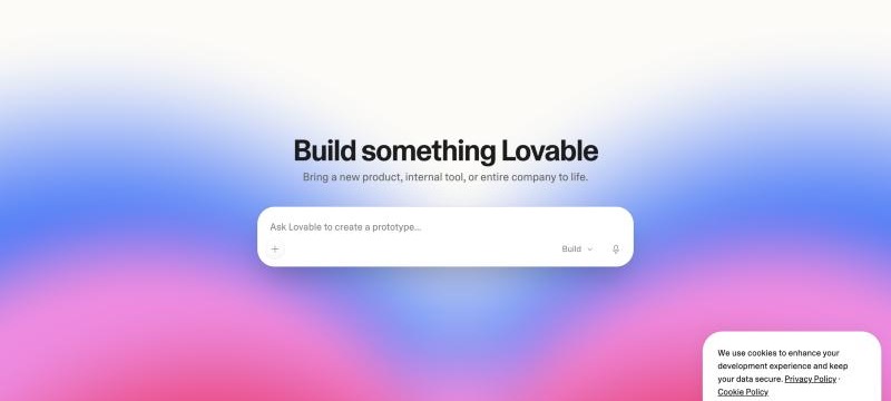
Lovable if you want a hosted project, a chat interface, and no local setup. It suits designers and non-developers. It generates React + Tailwind by default, which is a good stack for animation.
Cursor or Claude Code if you're comfortable with a local repo and want control over every file. Iteration is fast once it's set up, and you can install any library directly. Claude Code is what I use day to day.
Bolt sits somewhere between them. I haven't built with Bolt, but the prompting approach below isn't tied to one tool; expect to adjust wording.
2. What's the one animation that matters?
The pages that feel "premium" usually have one dominant motion idea, not six. A hero with an aurora background and a text reveal. A product section with 3D tilt cards. Pick one, make it excellent, and keep everything else subtle.
3. What's the structure?
Write the section list before you open any tool. A typical one for a SaaS-style landing:
- Hero (headline, subhead, CTA, animated background)
- Logo strip (social proof)
- Features (3–6 cards)
- How it works or product shot
- Testimonials
- Pricing
- Final CTA + footer
For a clinic or studio site the list looks different (services, team, prices, booking), but the principle is the same. If you don't want to write this yourself, Relume says it generates sitemaps and wireframes from a description; I haven't used it, so treat that as a lead to check, not a recommendation from experience.
Step 1: Set up the project
In Lovable: new project, and in the first prompt establish the foundation before any sections:
Create a landing page project. Stack: React, Tailwind, Framer Motion. Dark theme by default with a CSS variable for the accent color. Add a
prefers-reduced-motionmedia query that disables non-essential animation. Set up a single-page layout with placeholder sections: Hero, Logos, Features, HowItWorks, Testimonials, Pricing, CTA, Footer. Each section is its own component. Don't add content yet.
In Cursor or Claude Code: scaffold with Vite + React + Tailwind, install framer-motion, then give the AI the same brief. Plain HTML, CSS and a little JavaScript also work well for a one-page site; just say so in the brief.
The reduced-motion line is the one people skip. Add it now; retrofitting it later means touching every component.
Step 2: Prompt structure that works
AI tools produce generic output from generic prompts. "Make an animated hero" gets a fade-in. The prompts that work have five parts:
- What — the section and its content
- Motion — the specific effect, timing, easing, trigger
- Constraints — mobile behavior, performance, reduced motion
- Stack — which library to use and which to avoid
- Don't — the common wrong turns for this effect
A hero prompt in this shape:
Build the Hero section. Content: headline "{headline}", subhead "{subhead}", primary CTA "{cta}", secondary link "See demo". Motion: full-bleed animated aurora background behind the text, three soft radial gradient blobs in the accent color that drift slowly (20–30s loop, ease-in-out), blurred 80px, opacity 0.5. Headline animates in with a staggered word reveal, 40ms per word, from 20px below. Constraints: on screens under 768px reduce to one blob and disable drift. Respect prefers-reduced-motion by rendering the static gradient. Stack: CSS keyframes for the blobs, Framer Motion for the text. Don't use canvas or WebGL; don't add new dependencies.
It's a long prompt, and that's the point: the more you specify, the less the AI has to guess, and the fewer rounds of fixes you need. When something does go wrong, it's most often the mobile layout.
If you'd rather not write these yourself, MotionSites AI sells prompts in exactly this form with per-tool variants. I'm a subscriber and use them on sites I build in code; I reviewed it here. Free sources of similar components are in my alternatives list.
Step 3: Five effects, with demos
Each demo below is a live, inspectable page. Open it, look at the code, and use it as a reference in your prompt ("like this, but in the accent color").
Effect 1: Aurora hero background
Soft drifting gradient blobs behind the hero text. A very popular effect right now, and one AI tools easily get wrong: too fast and too saturated.
Prompt tip: specify the loop duration. A short loop looks like a screensaver. 20–30 seconds reads as ambient.
Effect 2: Text reveal on the headline
Words or characters animate in with a stagger. Pairs with any background. Keep the whole reveal short, under a second, or visitors start reading before the words arrive.
Prompt tip: ask for word-level, not character-level, stagger for longer headlines. Character stagger looks fussy at scale.
Effect 3: 3D tilt cards in the features section
Cards tilt toward the cursor with a subtle glare. AI versions tend to over-rotate. Ask for a small maximum angle, around 8–10 degrees, and a spring return.
Prompt tip: disable on touch devices. Tilt-on-hover on a phone is dead code at best and a source of scroll jank at worst.
Effect 4: Marquee logo strip
Infinite scrolling logo row with fade-out edges. Ask for the row to pause on hover and for the gap between logos to be fixed, not percentage-based, or it'll drift on resize.
Prompt tip: ask the AI to duplicate the logo set in the DOM for a seamless loop rather than using a JavaScript scroll. CSS-only is smoother and respects reduced motion more easily.
Effect 5: Spotlight cursor on the pricing or CTA section
A radial light that follows the cursor over a dark section. Cheap to run, striking on first visit. Use it once per page.
Prompt tip: the light should be a radial-gradient positioned with CSS variables updated on mousemove, not a DOM element that moves. Tell the AI this, or it may create a div that lags.
Other effects worth keeping in the kit: particle grid, gradient mesh, scroll parallax, typing terminal (for dev-tool landings), orbit rings (for integration sections).
Step 4: Build one section at a time
Prompt one section, check it on desktop and mobile, then move to the next. Don't ask for the whole page in one prompt. Two reasons:
- The AI's attention is finite. A six-section prompt tends to get six mediocre sections.
- When something breaks, you know which prompt caused it.
In Lovable, select the specific element before prompting changes; it keeps the AI from rewriting unrelated sections. In Cursor or Claude Code, name the file explicitly ("in Hero.tsx, ...").
Step 5: The performance pass
Once every section exists, run one prompt across the page:
Audit all sections for animation performance. Replace any animation of
top,left,widthorheightwithtransformoropacity. Addwill-change: transformonly to elements that actually animate. Make sure every animation stops when the element is off-screen (use IntersectionObserver or Framer Motion'swhileInView). Confirm theprefers-reduced-motionfallback renders a static version of every section.
Then check Lighthouse. For a landing page I aim for a high mobile performance score, ideally 90+. Aurora backgrounds and particle effects are the usual suspects; blur radius and particle count are the knobs.
Step 6: Content and copy
The animation is done. Now the hard part. Replace every placeholder with real copy, and read the page as a visitor. If the hero says something you'd skip, no amount of aurora will save it.
I write copy outside the tool (a doc or a text file), then paste it in with "replace the Hero content with exactly this text." When the AI writes the copy, you tend to get "Unlock your potential" over a very nice gradient.
Step 7: Handoff
Lovable: connect GitHub, publish, and give the client the live URL. If they'll edit content, either wire a simple CMS or keep edits as a service.
Cursor or Claude Code: deploy to a static host such as Vercel, Netlify or Cloudflare Pages. Same CMS question.
If the client needs to edit content regularly and there's no app logic, this might be better as a Framer project; that's what I often choose for clients who want to update their own site. Some people use Webflow for the same reason, though I haven't built in it. I cover that decision in Framer vs Webflow vs Lovable.
Common mistakes
- Too many effects. One dominant, the rest subtle.
- No reduced-motion fallback. It's an accessibility issue and can cost you in audits.
- Animating layout properties. Jank on mid-range phones.
- Letting the AI write the copy.
- Prompting the whole page at once.
- Skipping mobile until the end. Check each section on a phone as you go.
FAQ
Do I need to know React to do this in Lovable?
No, but it helps to know the vocabulary: component, props, Tailwind class, Framer Motion. You'll use these words in prompts, and the AI responds better to them than to "the box thing."
Can I use these prompts in Framer or Webflow?
Not directly. They produce React code. In Framer, build the effect visually or use a code component. In Webflow, you'd use its interactions or embed custom code. The demo pages are still useful as references for what you're aiming for.
How long does an animated landing page take this way?
It depends on the page, the client and how much feedback there is, so I won't give you a number. What I can say is that structure and animation go much faster with detailed prompts than with vague ones, and copy usually takes longer than either.
Where do the prompts in this guide come from?
I wrote the examples here for this guide, based on the way I brief AI tools in my own work. MotionSites AI sells more polished, per-tool versions of the same idea; 21st.dev and Magic UI offer free components you can turn into prompts. See the alternatives article for the full list.